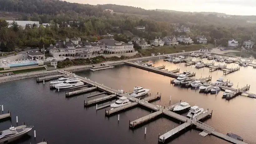
Madeline and Brent’s Bay Harbor Yacht Club wedding was gorgeous and timeless, but also so much fun! The couple had tons of thoughtful event branding throughout each portion of the day, leaving no stone left unturned. What a treat for their loved ones. Thanks to their photographer Kate Headley, we can revisit their beautiful day.
Design Elements for this Bay Harbor Yacht Club wedding
Inspiration and Event Goals
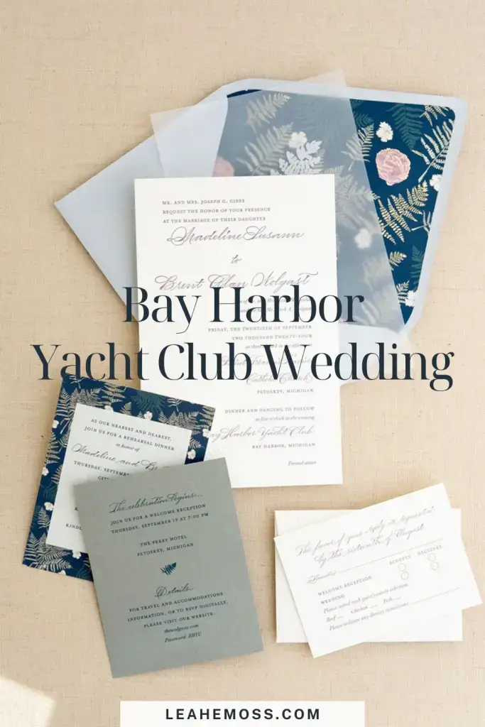
Madeline wanted purple to be the primary color for the stationery, since it would be the accent color on the day of the wedding. This way, the overall blue palette wasn’t overwhelming.
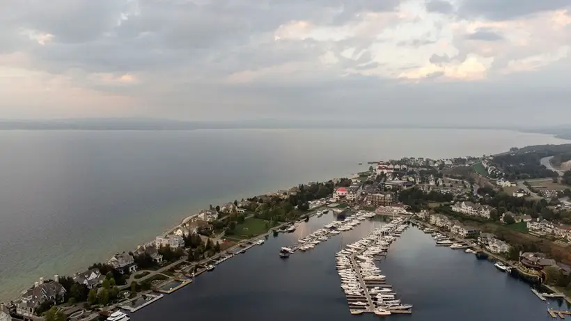
She didn’t want to lean into the “nautical” theme, which is a natural thought for lots of people who have a Bay Harbor Yacht Club wedding. She wanted to focus more on the soft, natural surroundings where the club is located — and the view it faces.
So, instead of that, we focused on ferns! I painted a variety of art elements, and then used those to create a custom pattern.
From Design Mockup to Reality
Here, you can see the digital mockup I sent to the couple as part of their stationery design process. You can see each element included, at scale and in reference to the other elements.
This is part of every proof round! Then, we take what was on screen and it translates to real life.
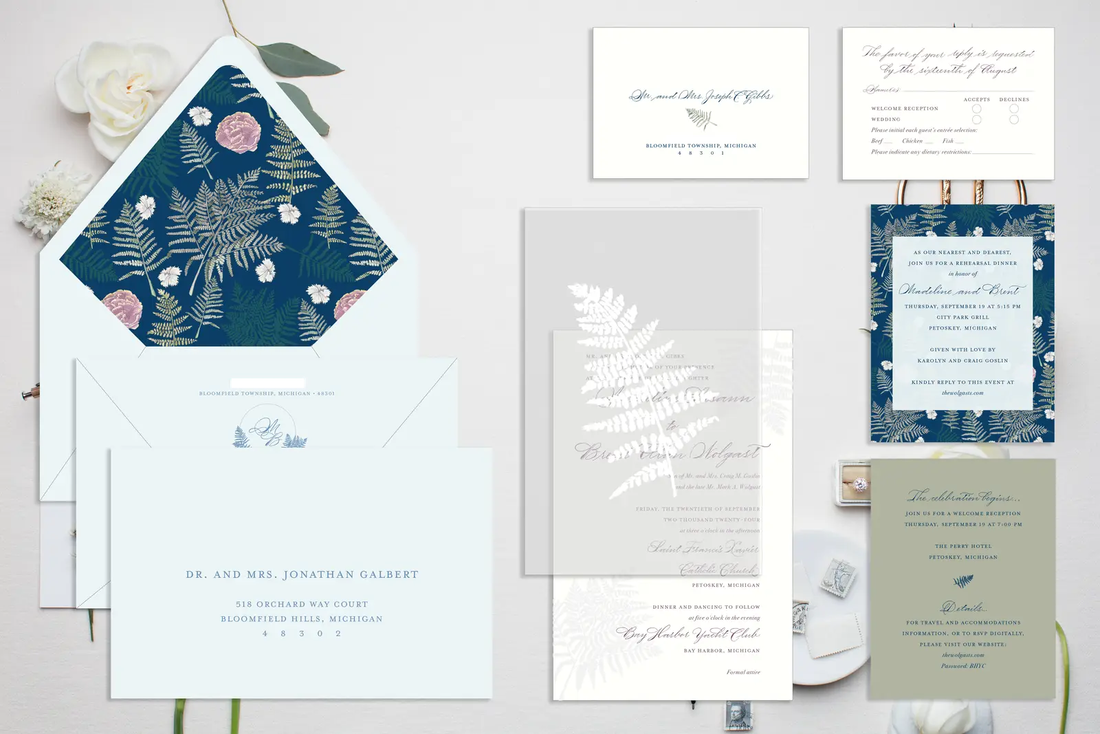
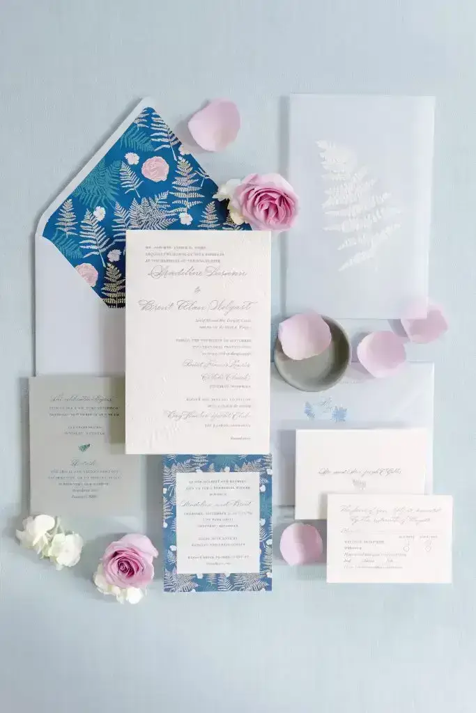
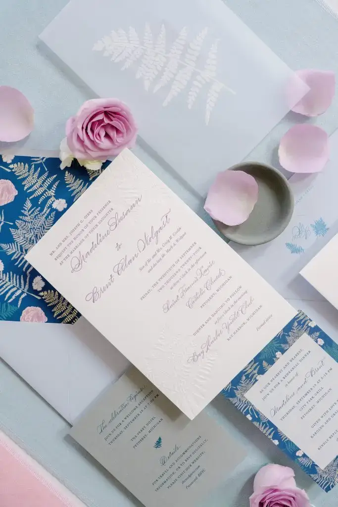
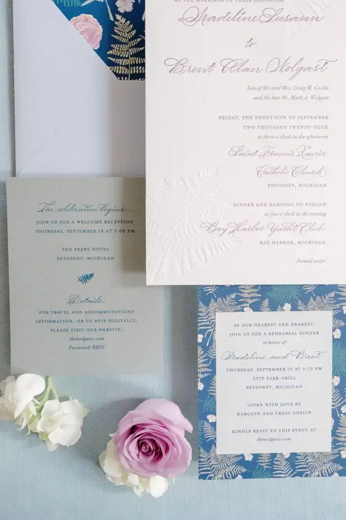
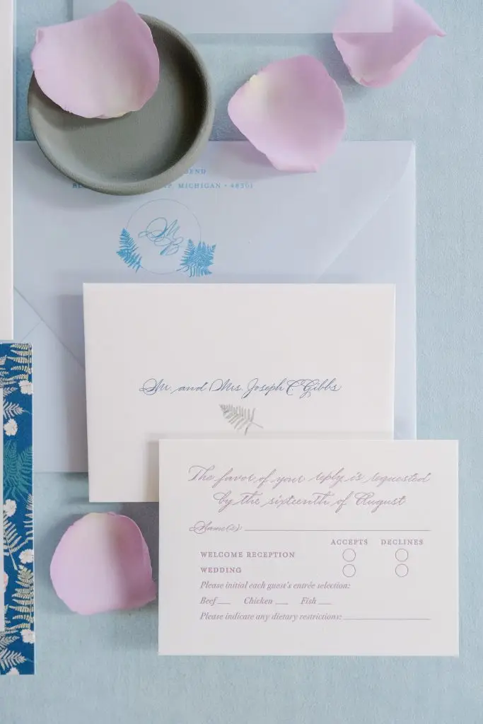
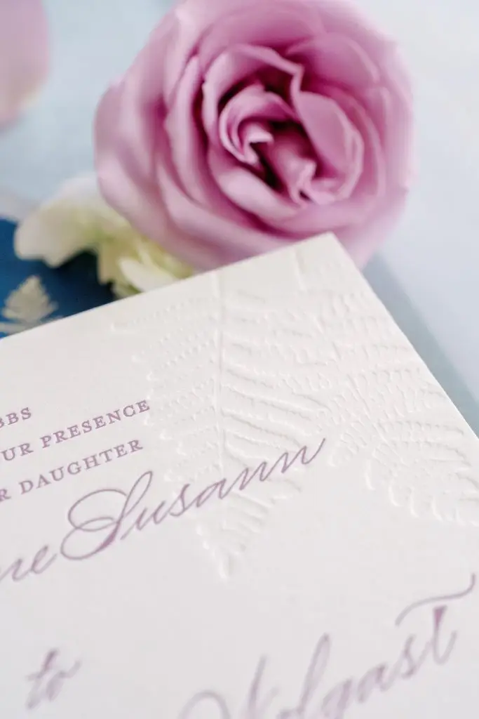
Invitations
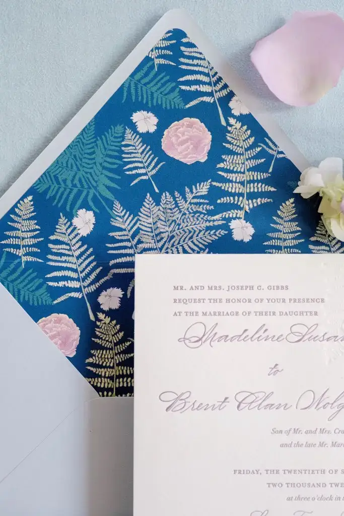
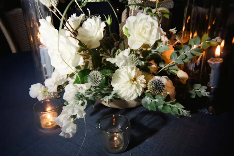
Madeline and Brent’s invitations featured this purple and blue color scheme, as well as the ferns throughout many details. This was one of my favorite invitations to design, with lots of amazing details:
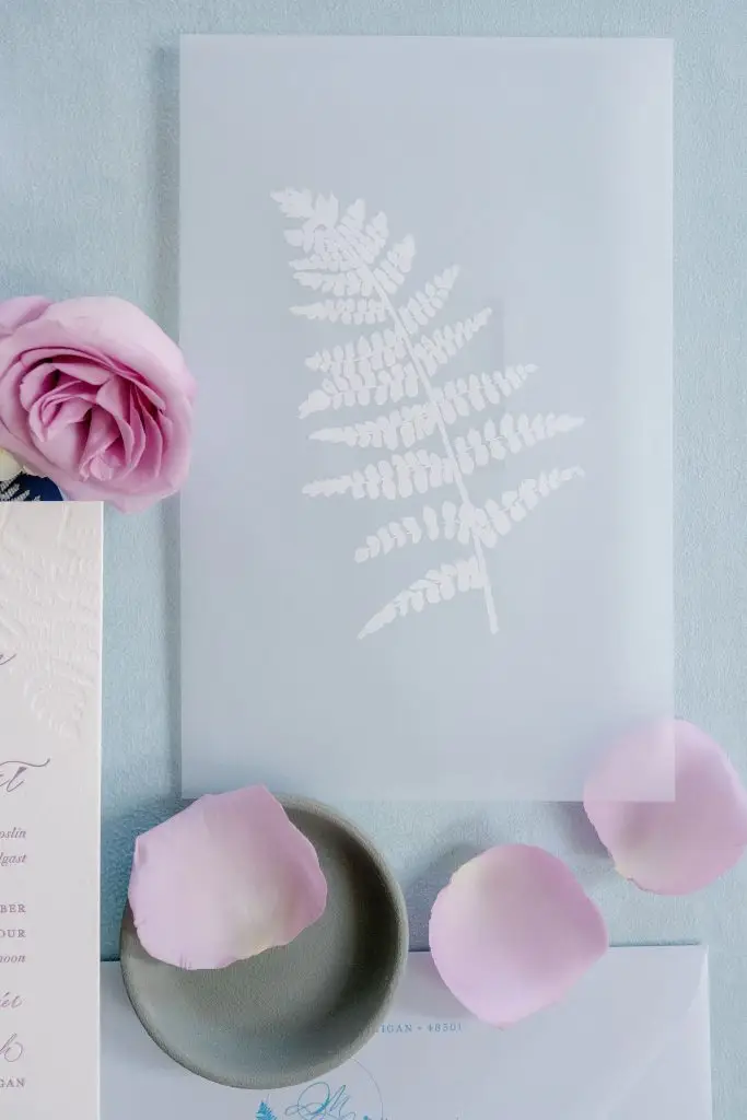
🤍 Vellum overlay with a white ink printed fern
🤍 Custom pattern used for their envelope liner and background on the rehearsal dinner insert card
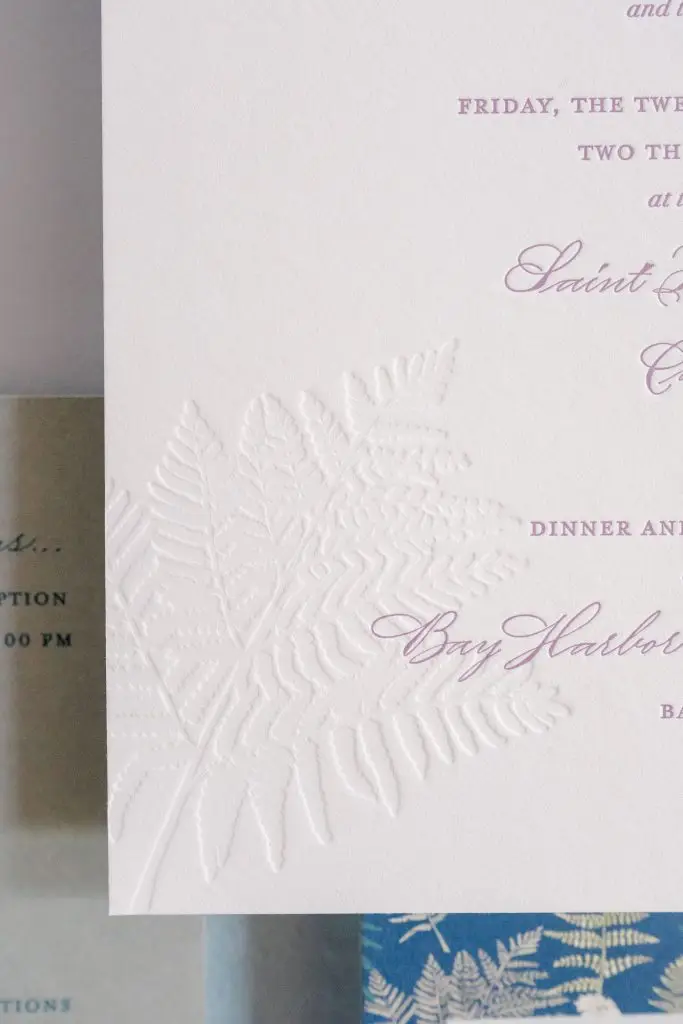
🤍 Blind letterpress ferns in opposite corners on main invitation card with purple letterpress ink for the text
These next few detail photos were taken separately, by Erin Schmidt Photography, in my studio. They were not part of the wedding day photos and are completely independent.
Personal Touch - Bridal Shower
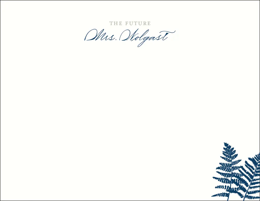
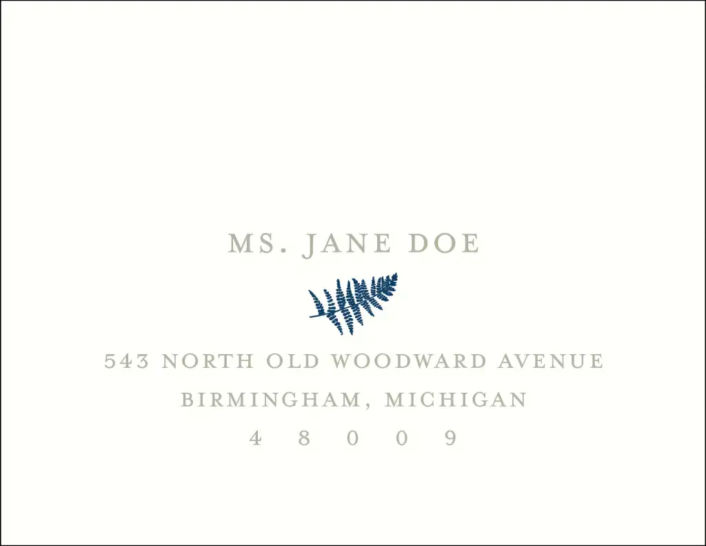
As an added personal touch, Madeline had me design the thank you notes for her bridal shower, to coordinate with their overall wedding aesthetic. These were different than the main wedding thank you notes I designed (which incorporated a gorgeous photo of the bride and groom), but still fit with everything else they had for the day! Just one more way to play into the event branding, well before guests arrived to their Bay Harbor Yacht Club wedding.
Here are the mockups of her note card and the front of the envelopes!
Ok, back to the wedding day, and back to the gorgeous images from Kate Headley.
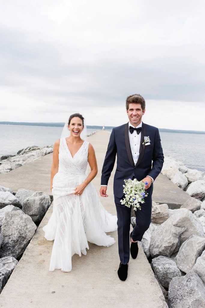
Getting Ready
Madeline and Brent each looked stunning. Here are a couple of their details.
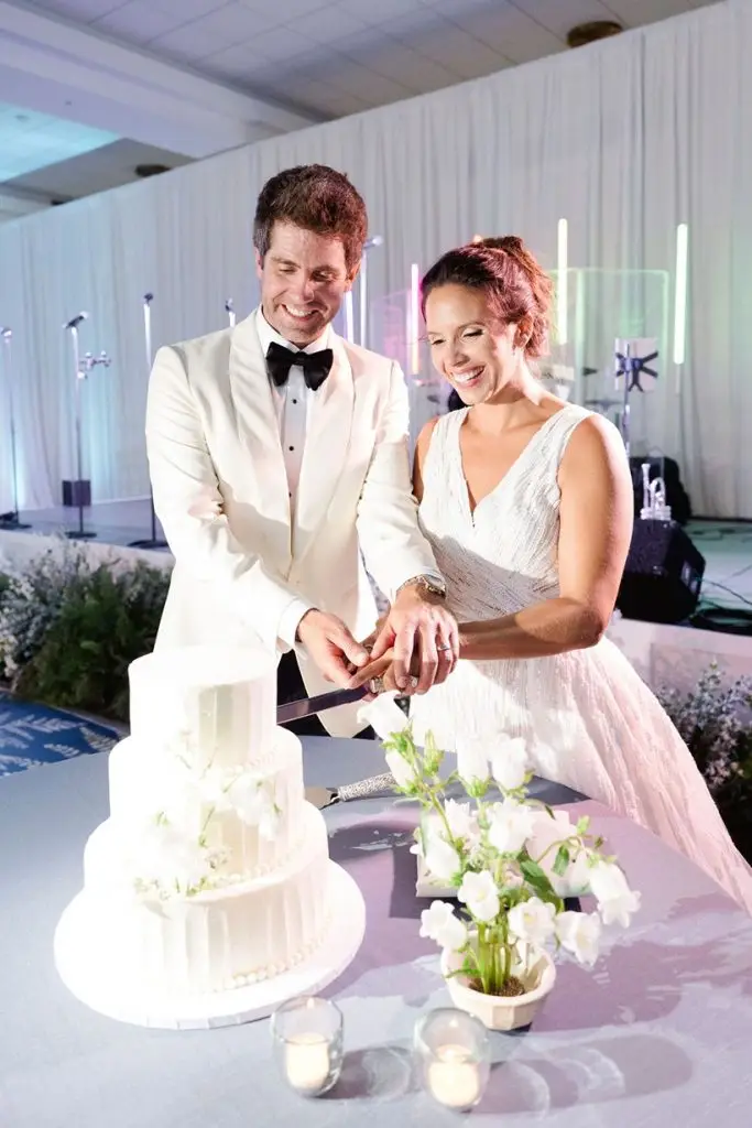
Ceremony at St. Francis Xavier Catholic Church
Because Madeline and Brent were getting married at St. Francis Xavier Catholic Church, they wanted to have me design a ceremony program. This guided their guests through the service.
Madeline’s bridal bouquet had two charms on it with photos of her maternal grandmother and Brent’s late father. It was very important to the couple to have both of them represented that day.
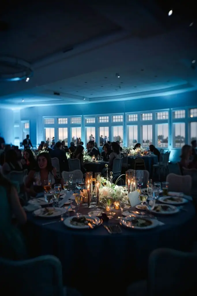
Reception Design Details
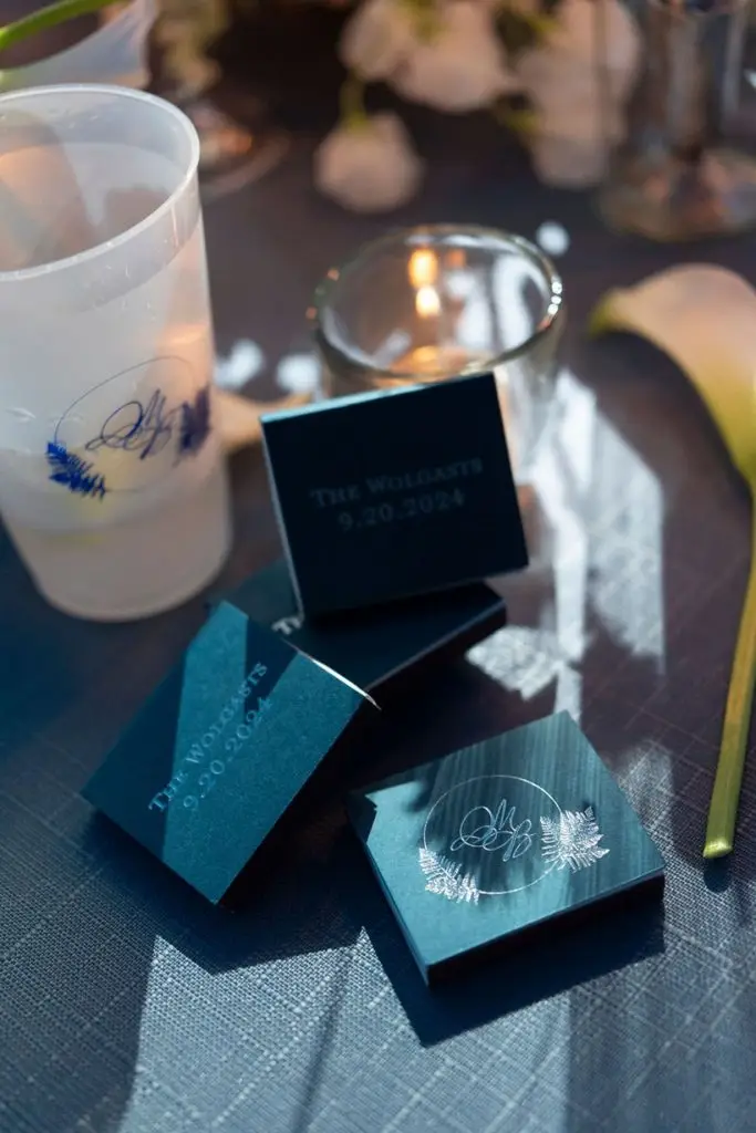
After the ceremony, guests headed to the cocktail hour, dinner, and dancing at Madeline and Brent’s Bay Harbor Yacht Club wedding. Even before the arrival, they had a personalized stationery element: a “Just Married” sign for the back of the car, featuring the custom pattern!
Welcome and Cocktail Hour
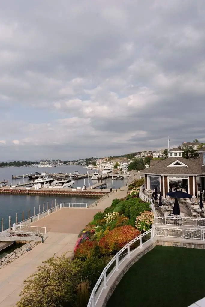
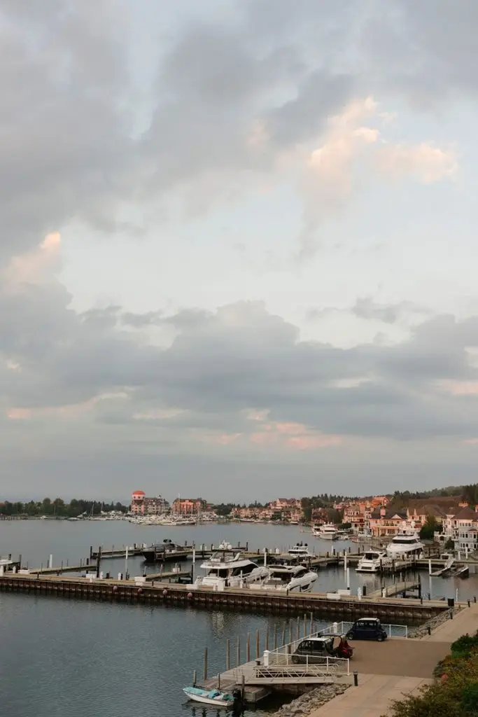
Guests enjoyed cocktails on the outdoor terrace. This is what Northern Michigan is all about!
As part of the floral (and in the stationery custom pattern), there were carnations as an accent. This represented the story of how Madeline’s parents met! So sweet to include this meaningful detail.
As Madeline put it, “My ‘something borrowed’ were the carnation accents in my bouquet, bar arrangements and table top florals. My parents met at Northern Michigan University while my mom was selling carnations for her dorm. Ever since it’s been their flower. My dad always gets my mom carnations for holidays, our birthdays or just because.”
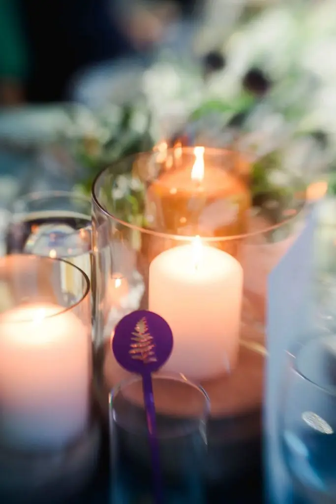
Fun bar details during cocktail hour…
🤍 Purple shimmer acrylic stir sticks, laser cut with the fern design
🤍 Custom cocktail napkins with the monogram
🤍 Acrylic bar signage, which is still fun even though it broke during setup (sad face!)
Guests were guided to their seats with escort cards. During cocktail hour, the couple also featured a family memories table, in honor of past love stories of their relatives and “in memory of” placards of loved ones they’ve lost.
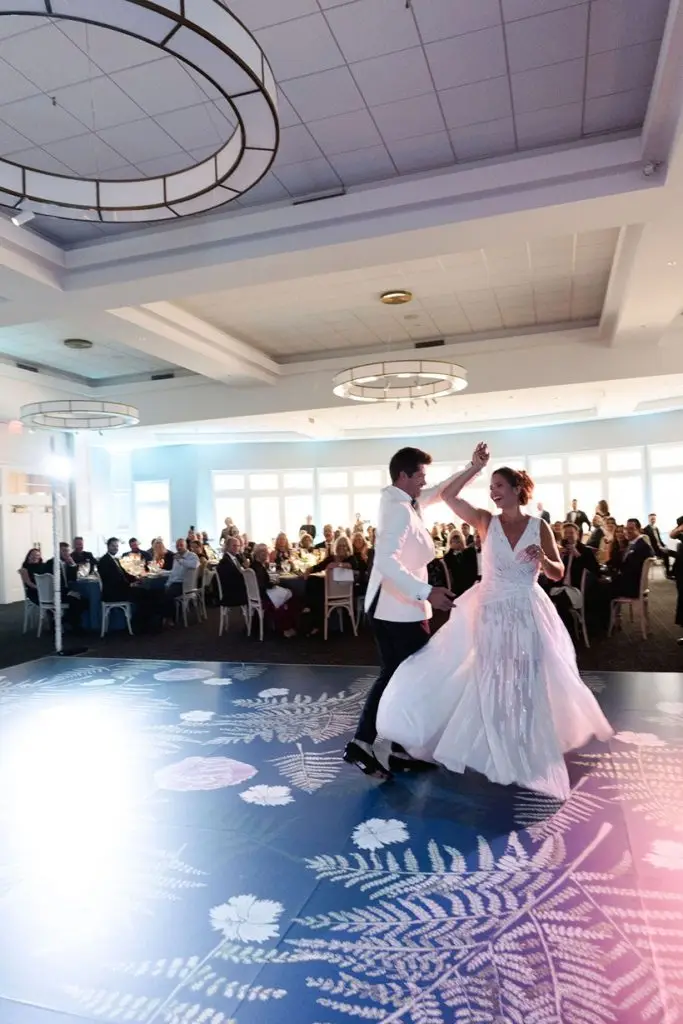
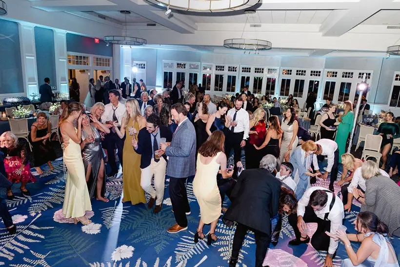
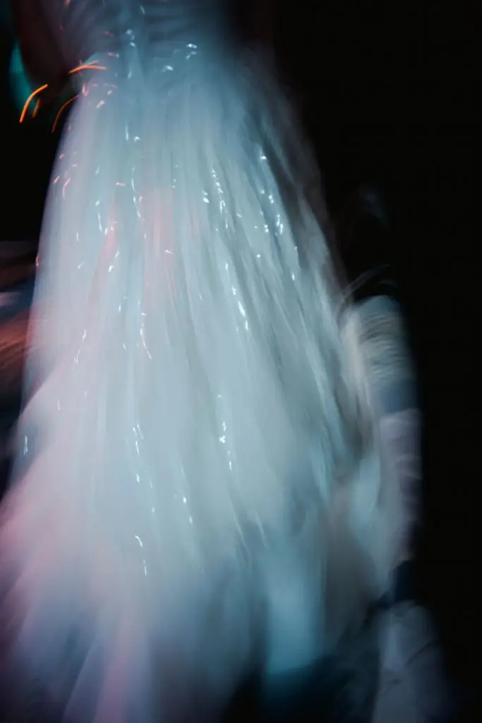
Installation - Custom Dance Floor
Madeline and Brent opted to install a custom vinyl wrap on their dance floor, featuring the same pattern from their invitation! What a fun way to carry this detail into their day, especially at such a large scale. Look for this in the photos of everyone dancing!
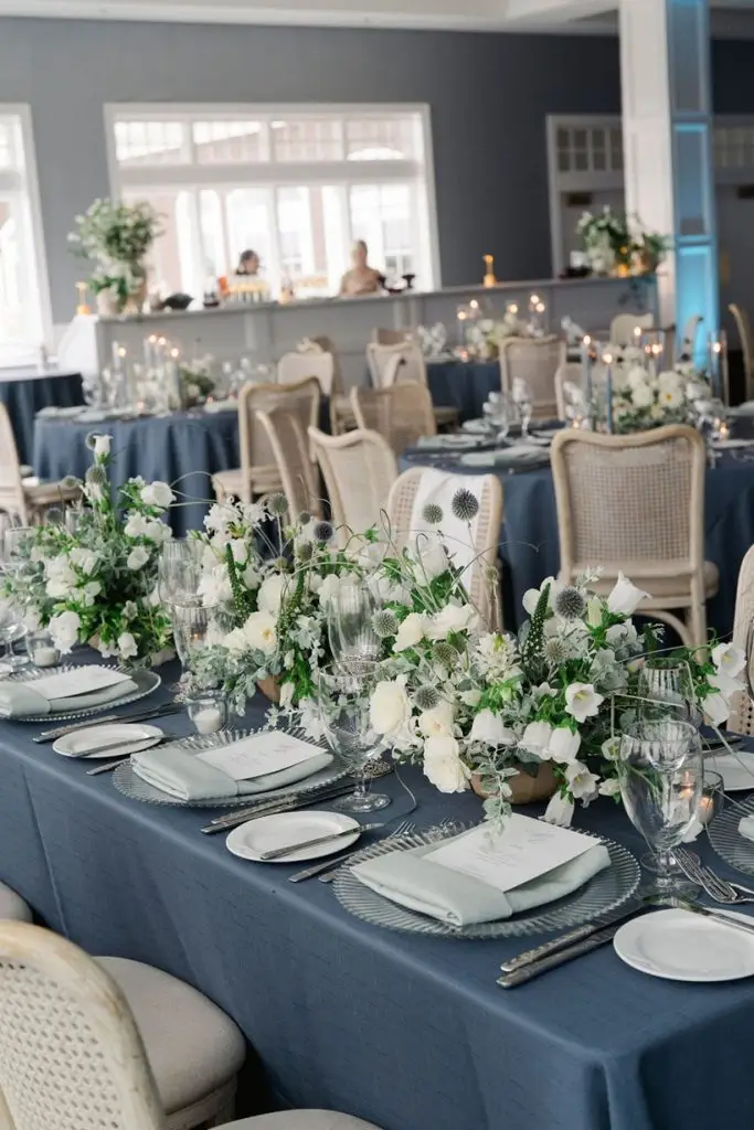
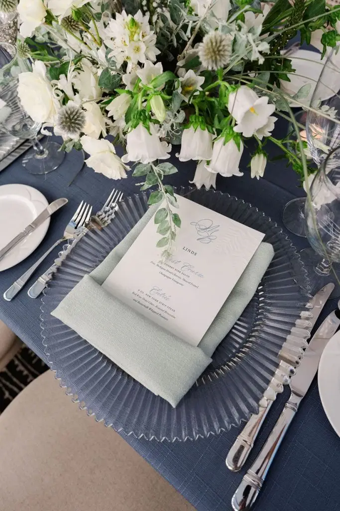
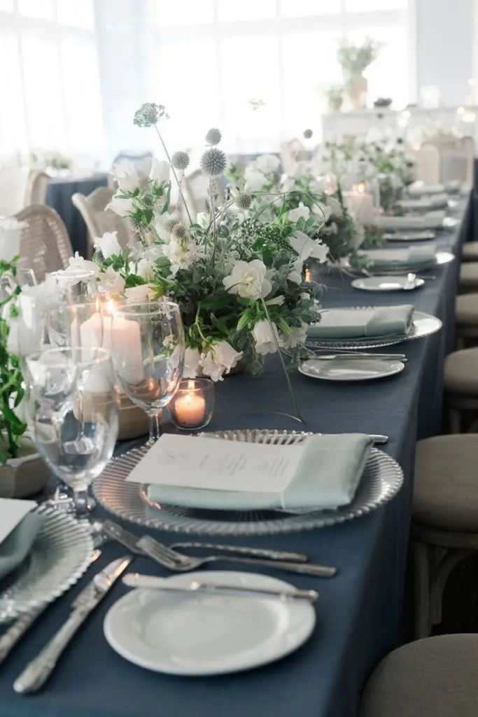
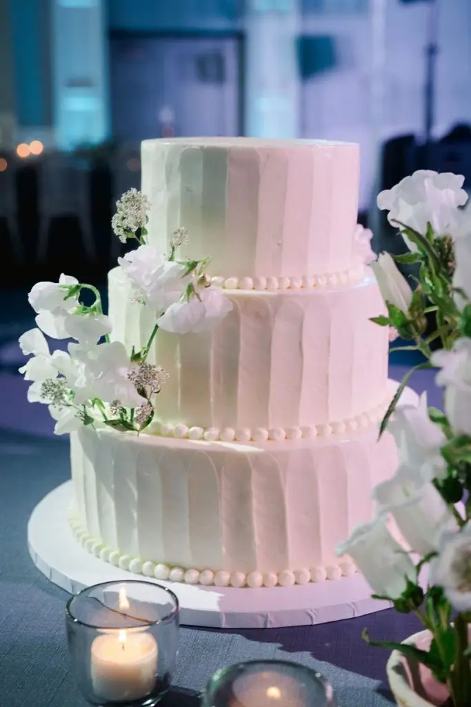
Tabletop Decor Elements
Madeline and Brent’s menu featured the same blind letterpress ferns from their invitation, as well as a personalization line at the top. This way, it doubled as their place card. Because of this specialized treatment, we also designed the menus in different colors, and with a different “entrée” section for each guest. This way, the catering staff knew which meal each guest had pre-selected at a quick glance, and the menus all still fit within their purple and blue color palette.
Bar and Late Night
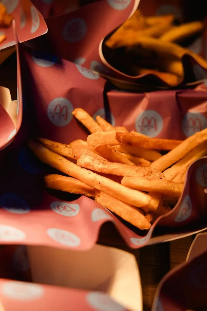
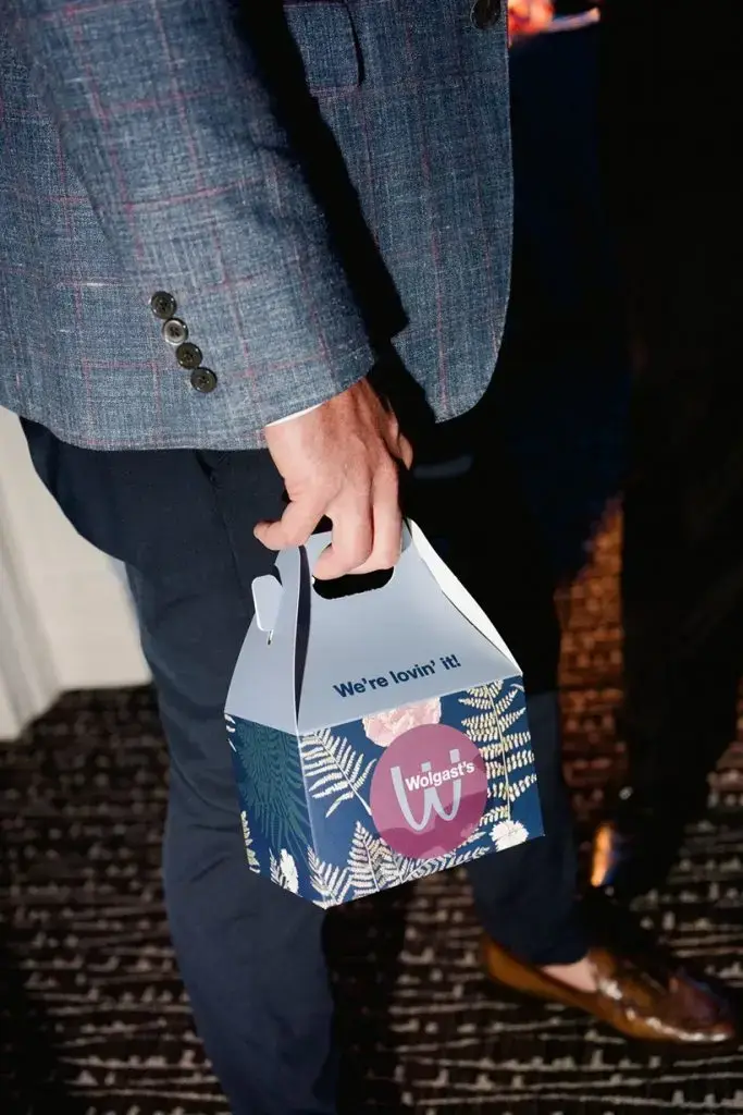
This is where Madeline and Brent really took the event branding for their Bay Harbor Yacht Club wedding to the next level. Brent’s dad is deceased and had been a builder. In his life, he had built a series of MD (shortened, but it’s obvious 😉) restaurants across the Midwest. To honor him in a playful way, Madeline wanted to do late night “happy meals” and I created a secondary wedding “logo” for them to use for these items.
For those people who knew Brent’s late father, they understood the deeper meaning. For those who didn’t, it was simply an amazing and fun way to end the night!
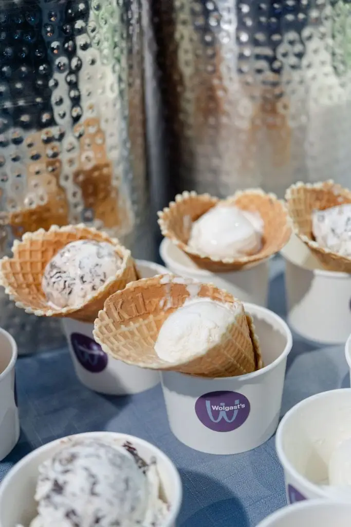
As an extra nod to family history, Madeline and Brent had a Kilwin’s ice cream bar as well. This was also served at Brent’s mom and stepdad’s wedding!
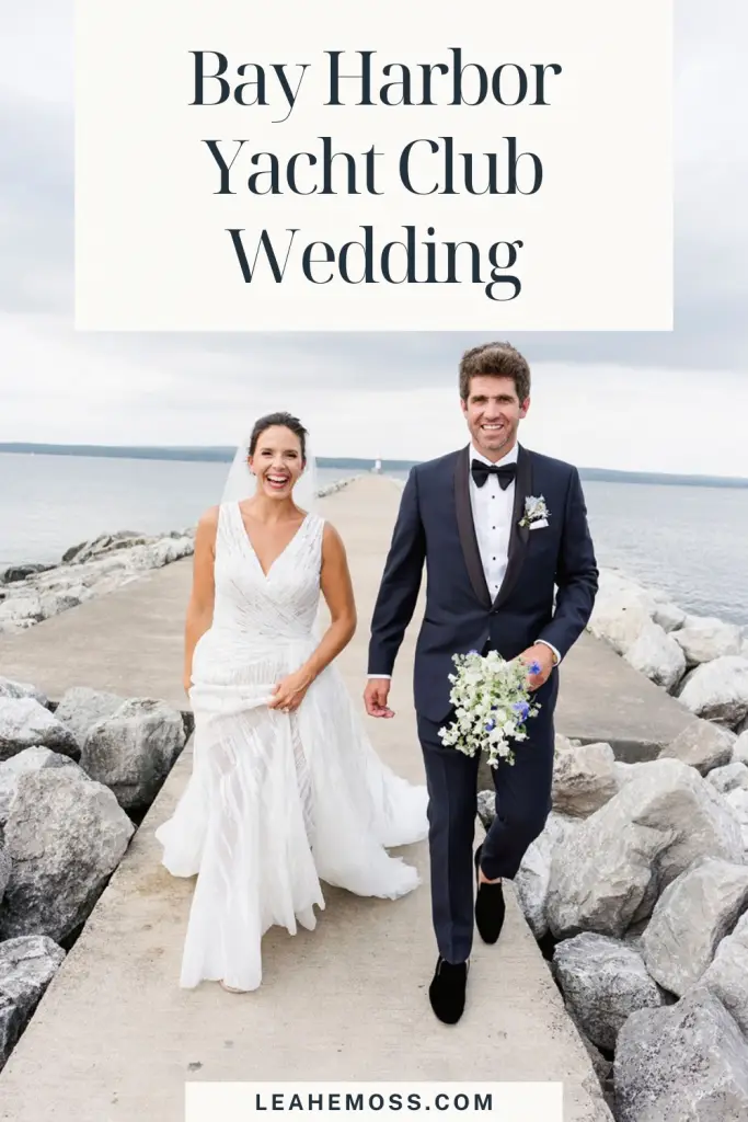
Portraits
Bay Harbor Yacht Club Reception
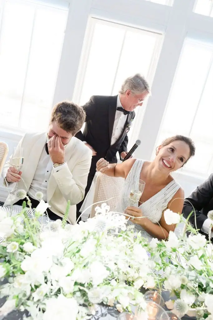
This crew really knew how to party! Congratulations to Madeline and Brent. Thanks for bringing me into your vendor dream team.
Vendor Team
Planning and design by the bride; week of coordinator: Dalia Atisha
Luxury wedding invitations designer, likely with ink stains on my hands.
If you’re new around here, nice to meet you! I’m an artist who designs luxury wedding invitations — and all the rest of your stationery to coordinate. Let’s tell your love story — on paper. Sentimental lovers like you deserve to remember joyous moments forever. Learn more about my story or my services, to see if I’d be a good fit for your special day!