I was recently chatting with my friend Sarah, who’s a self-proclaimed “COVID bride.” She told me that so many of her fellow brides have asked in their group chats about how to repurpose their original wedding color palette for a new date, that falls in a different season from the original one. If you’ve been planning a 2020 wedding that’s now at a different time of year in 2021 or 2022, this blog is for you! Sarah, I hope this is helpful for you and your fellow COVID couples… thanks so much for letting me know that this was such a hot topic!
In this blog, I’ll cover a few helpful tips to make your original wedding color palette work for a different season. I’ll also provide a couple of concrete examples of these ideas in action.
After getting engaged, your wedding color palette was likely chosen early on. It helps set the tone for the rest of your day. With that in mind, you selected your bridesmaids’ dresses – and they’ve been purchased. Likewise, you may have already booked certain things with vendors that match the ideal vision in your head. Trying to make fall jewel tones fit for a spring wedding may feel like forcing a square peg into a round hole, but I promise it can be done beautifully – with a few modifications!
Original main color transitions to accent
In your original wedding color palette, you had your “main” color as the common item. For your new date, keep this color, but have it become the accent tone. When paired with more seasonally-appropriate items, it can still be lovely and coordinate seamlessly! If your bridesmaids were going to be wearing your focal color, there’s no reason that they can’t still wear the dress color you’ve already picked. They’ll simply now be the accent! Ensure that their bouquets highlight the new color palette more prominently, with small pops of the dress color. Similarly, if your table linen featured the main hue as part of your original wedding color palette, consider changing the linen color (most rental companies will allow for changes like this with ample notice), but keep that same tone as your napkin or place card. By keeping pops of it, you’ve transitioned it to an accent, without getting rid of it entirely – you’ve just made it more seasonally appropriate.
Use stationery to bridge the gap
If you have to send a postponement announcement and/or new wedding invitations, your stationery can be a great way to bridge the gap and provide some unity to your wedding color palette from one season to the next. Plus, you can tease out the updated palette, which is always fun! For example, if you had fall jewel tones originally and now have a spring date, you can still incorporate those jewel tones into your invitation — perhaps as the text color or the cardstock for a details insert card — just don’t make them the key focal point of your suite. Keeping with this example, the small insert card could be a deep burgundy or emerald green from your original wedding color palette, but the envelope, liner, and main letterpress ink colors all lean more toward lighter spring blush tones. You’ve now made a seamless transition from what was perhaps on your save the dates (or your first round invitations) into a preview of what’s to come on the new big day.
Metallics and neutrals go with any wedding color palette
As a reminder, metallics and neutrals go with everything, regardless of season! So, here’s the easiest tip: maintain your originally chosen ones throughout! Gold pairs just as beautifully with fall tones as it does with spring hues. So why bother swapping it? If you liked it the first go around, why not have it for the second version?! You’ve got enough on your plate with planning that you should keep things easy on yourself wherever possible. Winter white and silver works just as beautifully for a soft white, sophisticated and modern summer garden event! Tan and rose gold feels appropriate for spring and autumnal events alike, so just stay the course on this one.
So, those are the tips! Let’s get into some real examples, shall we?
Example 1 – fall wedding that’s now next spring
Original wedding color palette: jewel tones
- Burgundy – main color (bridesmaids’ dresses, linen, lots of this in florals)
- Navy – secondary color (mens’ suits, stationery)
- Harvest tan – accent
- Rose gold – accent
Updated wedding color palette:
- Dusty rose and harvest tan – main colors
- Burgundy, navy, rose gold – accent colors
So how does this work?
Attire: don’t do anything! Your wedding party has most likely already purchased their wardrobe, so leave it alone. Your bridesmaids will be the accent color burgundy, and groomsmen will be the accent color navy. Gorgeous.
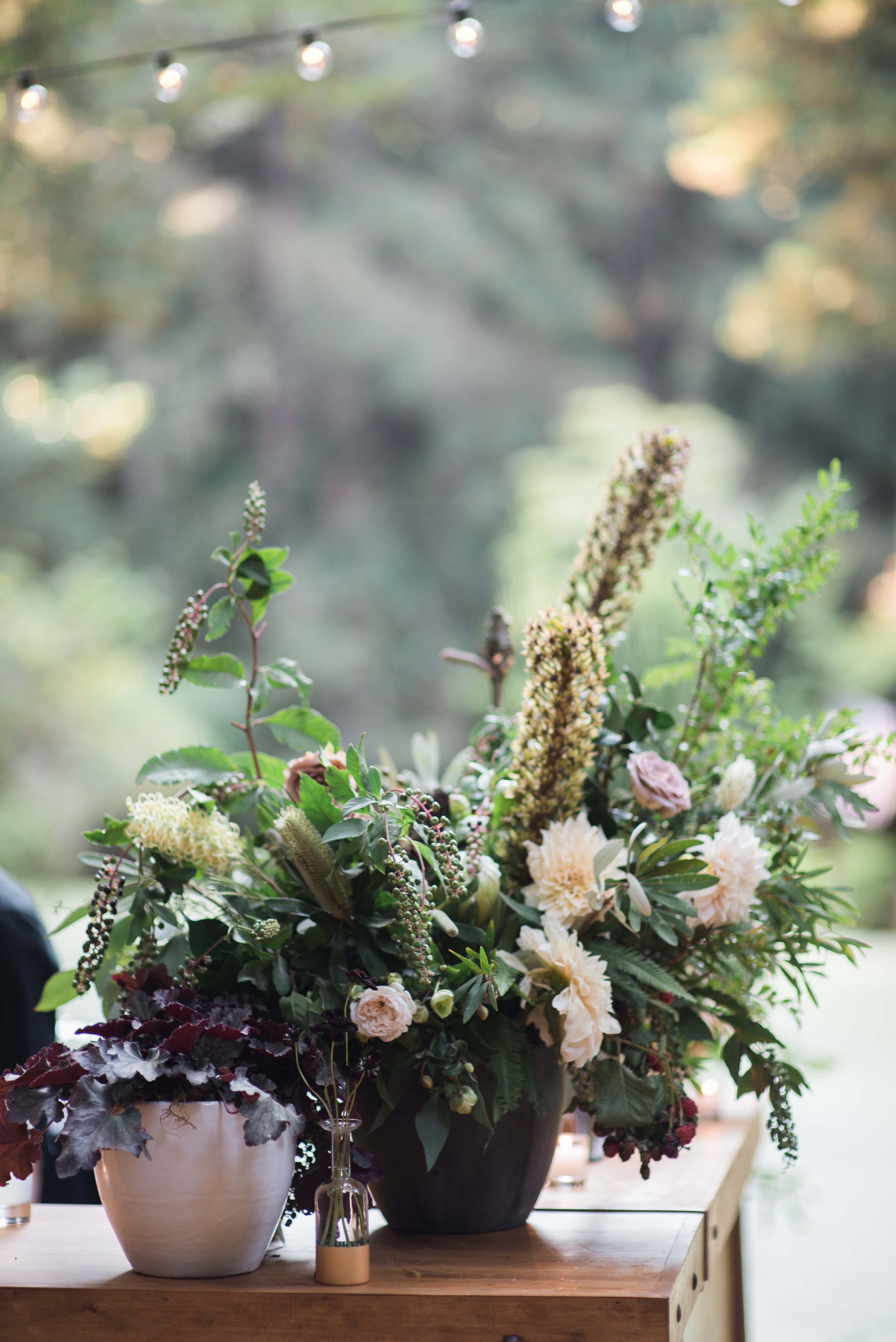
Florals and linens: this is the biggest change. Instead of having burgundy as your primary palette for the florals, swap this out for dusty rose, tans, and blush tones. Bring in small pops of burgundy as accents, and use navy as the wrap for bouquets as a secondary accent. Keep your rose gold accent here for the vase selections as well as votive holders. Update your linen from burgundy to a dusty rose color. Consider a burgundy accent piece, such as a silk runner atop the linen, or your napkins.
Stationery: for your new invitations, bridge the gap between the two wedding color palettes, with some thoughtful discretion. Use navy text with a burgundy ribbon as a nod to the original version (which may have already been sent in your previous invitations). Create the focus to be on the dusty rose and harvest tan colors through paper stock colors, envelope colors, and a pattern for your liner (hello, peony season!). Rose gold envelope calligraphy is the icing on the cake. Duh.
On the actual wedding day, use this new color palette in your paper goods, as well. Highlight them on your menus, ceremony programs, and signage. As I mentioned above, using something small (like your place cards) is a great way to pepper in those little touches of your now-accent-colors.
Example 2 – summer wedding that’s now next fall
Original wedding color palette: citrus brights
- Coral – main color (bridesmaids’ dresses, linen, lots of this in florals)
- Yellow/orange and navy – secondary colors (mens’ suits, stationery)
- Gold – accent
Updated wedding color palette:
- Burgundy – main color
- Coral and navy – accent colors
- Update yellow/orange to muted mustard and rust – accent colors
- Gold – accent
So how does this work?
Here, keep what was your focal point and adapt it to accents. Tone down your original accent colors to more earthy neutrals (rather than than tropical burst). Add in some seasonally-appropriate tones to bring it together and you’ll have a beautiful end result!
So there you have it — my tips to use your wedding color palette in a new season. If this was too long to read, here are the key takeaways:
- Original main color transitions to accent
- Use stationery to bridge the gap
- Metallics and neutrals go with any wedding color palette


